Statistics
See some statistics about observations submitted.
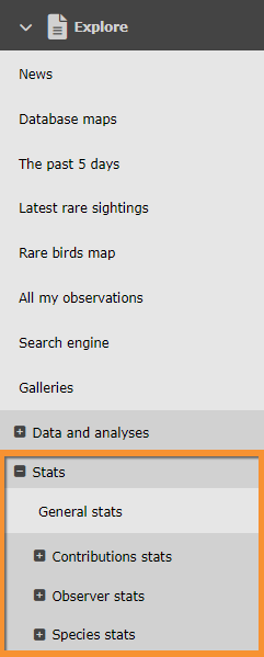
Access statistics on the left hand column under Explore tab (see image Statistics).
NOTE: unregistered users can only access General stats. To register, see wiki section Web interface > Getting started > Registration.

Statistics.
General stats
See
· general statistics such number of contributions or species recorded; or
· list statistics.

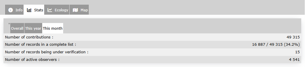
General stats
General stats.
Select from the tabs above which period of time you wish to see statistics for:
· Overall,
· This year, or
· This month.
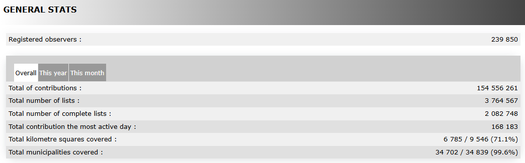
See general numbers on the upper part.
Move the pointer on labels to see the description of this example.
|
General data. Example. Registered observers Timeframe Total of contributions Total number of lists Total number of complete lists Total contributions the most active day Total squares kilometres covered Total municipalities covered |
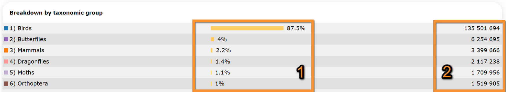
See statistics by taxonomic group or species.
Move the pointer on labels to see the description of this example.
|
Breakdown by taxonomic group. Example. Birds Butterflies Mammals Dragonflies Moths Orthoptera
1. Relative numbers |
|
Distribution of species by taxonomic group. Example. Moths Beetles Spiders Birds True bugs Hymenoptera
1. Relative numbers |

[Top to General stats]
[Back to Statistics]
Lists statistics

Lists stats.
Indicates which proportion of lists include the selected species.
1. Select between:
· Species presence to see the proportion of lists that registered the selected species on a specified geographical area.
· Presence comparison by area to compare the presence of selected species between two geographical areas.
· Presence comparison by year to compare the presence of selected species between two years.
2. Show the graph.
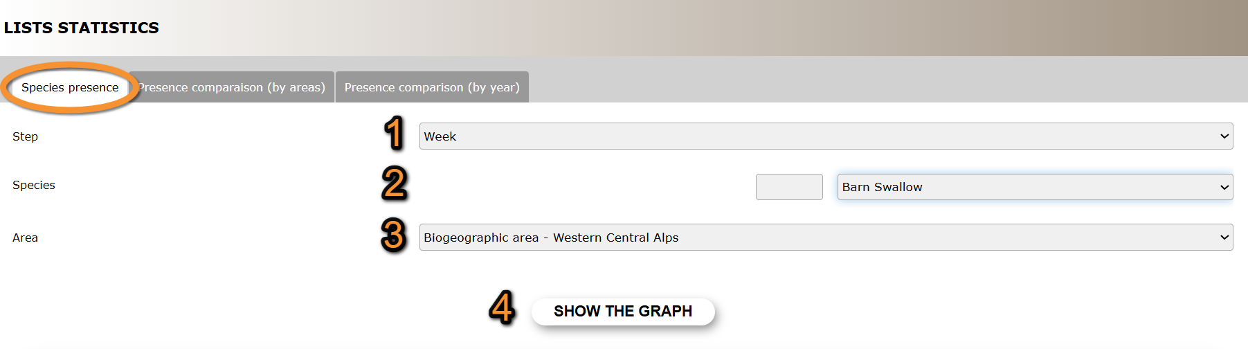
- Species presence
- Species presence
Percentage of submitted lists at the geographical area selected that contains at least one observation of the selected species.
Species presence.
1. Step: Select from the expandable menu to see data grouped by week or not grouped (day).
2. Species: Select specie. Type name of species, or part of it, on the left hand field, and/or select from the expandable menu on the right.
3. Area: Select from the expandable menu the geographical area to visualise.
4. Show the graph: See results.
Move the pointer on the image to see the description of this example.
|
Species presence. Results.
1. Check/Uncheck to select times to show. Legend Date September data |
- Presence comparison (by area)
- Presence comparison (by area)
Percentage of submitted lists in the two selected geographical areas that contain the selected species.
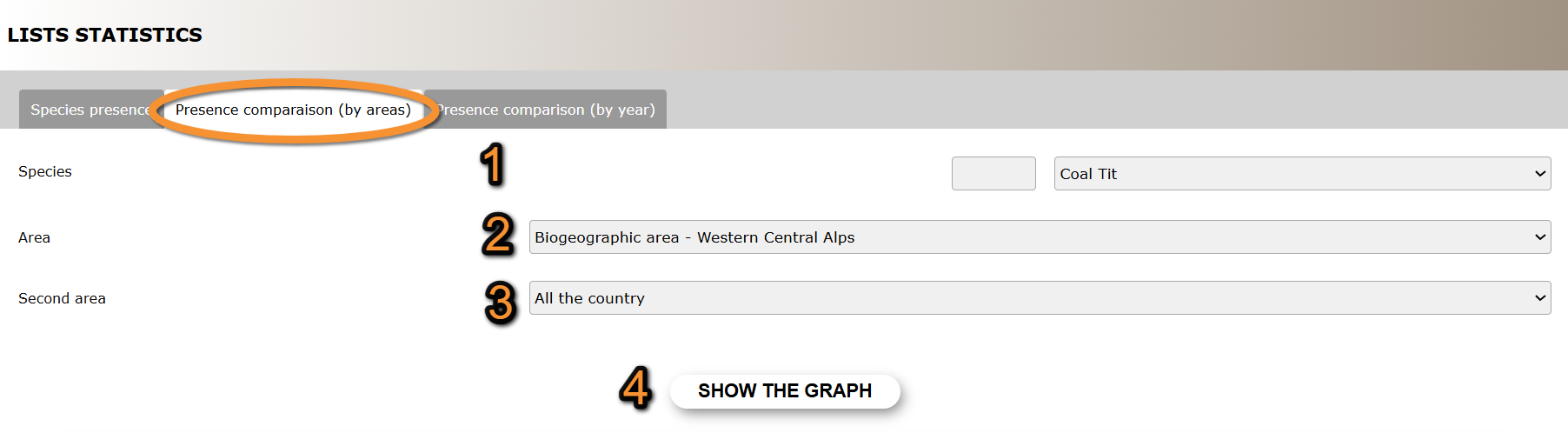
Presence comparison (by area).
1. Species: Select specie. Type name of species, or part of it, on the left hand field, and/or select from the expandable menu on the right.
2. Area: Select from the expandable menu one of the geographical areas to compare.
3. Second area: Select from the expandable menu the other geographical area to compare.
4. Show the graph: See results.
Move the pointer on the image to see the description of this example.
|
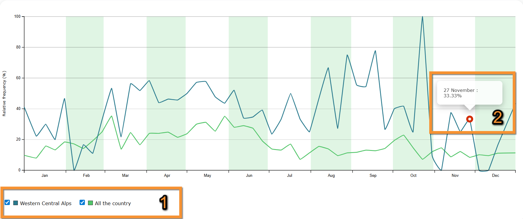
Presence comparison (by area). Results.
1. Check/Uncheck to select times to show. Legend Date May data |
- Presence comparison (by year)
- Presence comparison (by year)
Percentage of submitted lists in the selected geographical area that contain the selected species in two selected years.
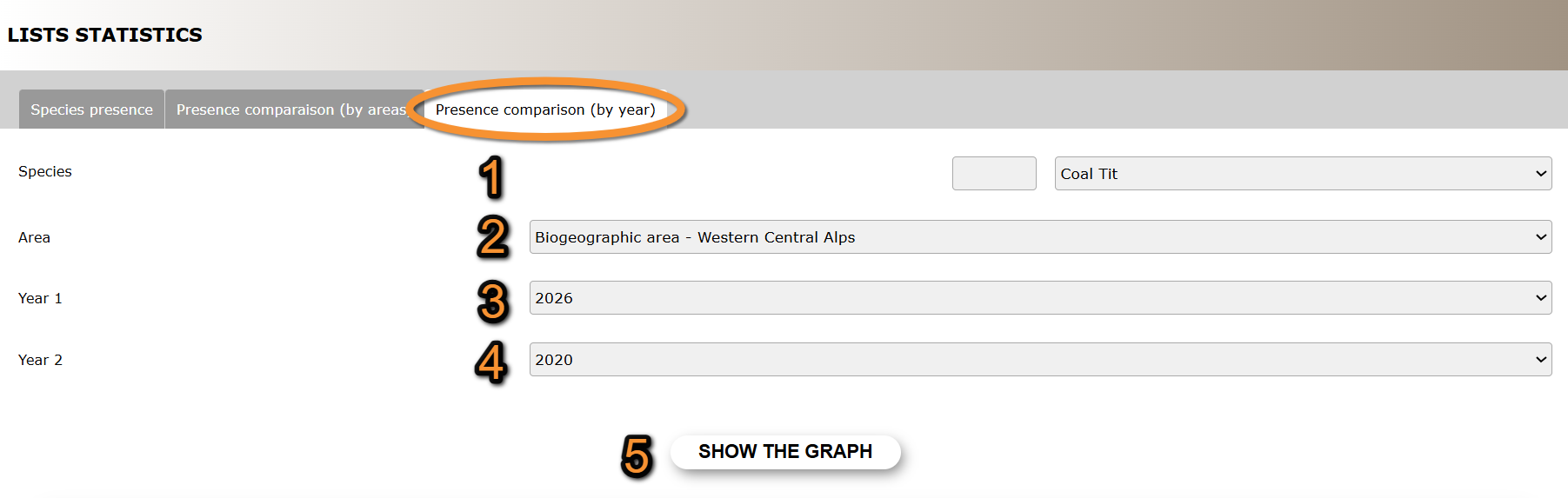
Presence comparison (by year).
1. Species: Select specie. Type name of species, or part of it, on the left hand field, and/or select from the expandable menu on the right.
2. Area: Select from the expandable menu the geographical area to visualise.
3. Year 1: Select from the expandable menu one of the years to compare.
4. Year 2: Select from the expandable menu the other year to compare.
5. Show the graph: See results.
Move the pointer on the image to see the description of this example.
|
Presence comparison (by year). Results.
1. Check/Uncheck to select times to show. Legend Date September data |
[Top to List statistics]
[Back to Statistics]
Contribution statistics
See distribution across time nad/or geographical areas.
Choose between
· Temporal distribution,
· Distribution by county,
· Info about lists, or
· Stats by municipality.
Note options are country dependant and not all options may be available in your local portal.

Temporal distribution
Temporal distribution. Menu.
See statistics for number of records, number of observers, number of lists or number of species across time.
1. Choose from the expandable menu on the top right the geographical regions to want to see.
By default, all country will show.
2. Choose from the tabs on top which area to visualise:
· Number of records.
· Number of contributors.
· Number of lists.
· Number of species.
3. Choose timeframe on tabs:
· Daily,
· Monthly, or
· Yearly.
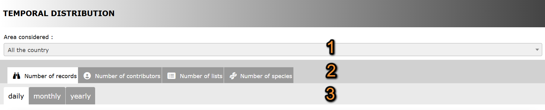
Temporal distribution. Selecting data.
1. Geographical area
2. Type of data
3. Timeframe
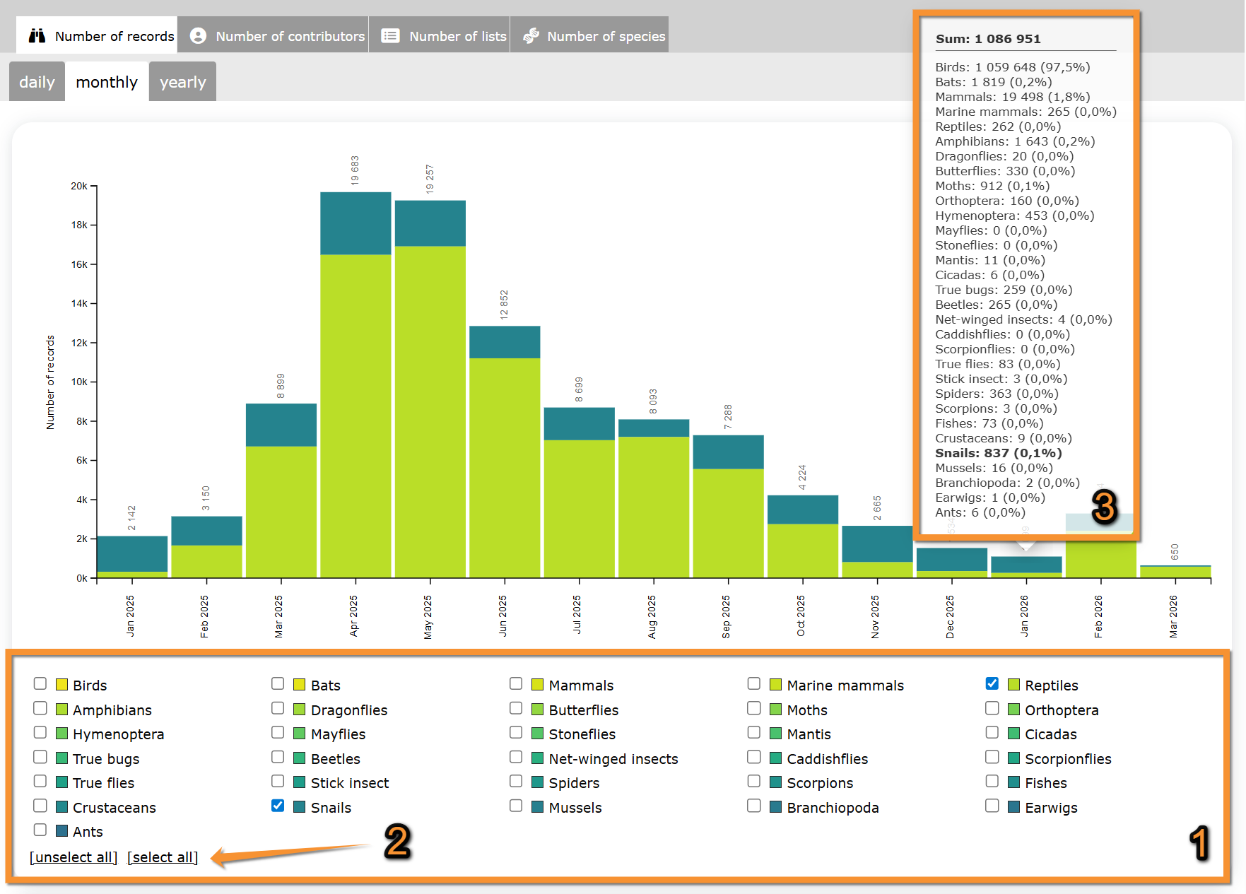
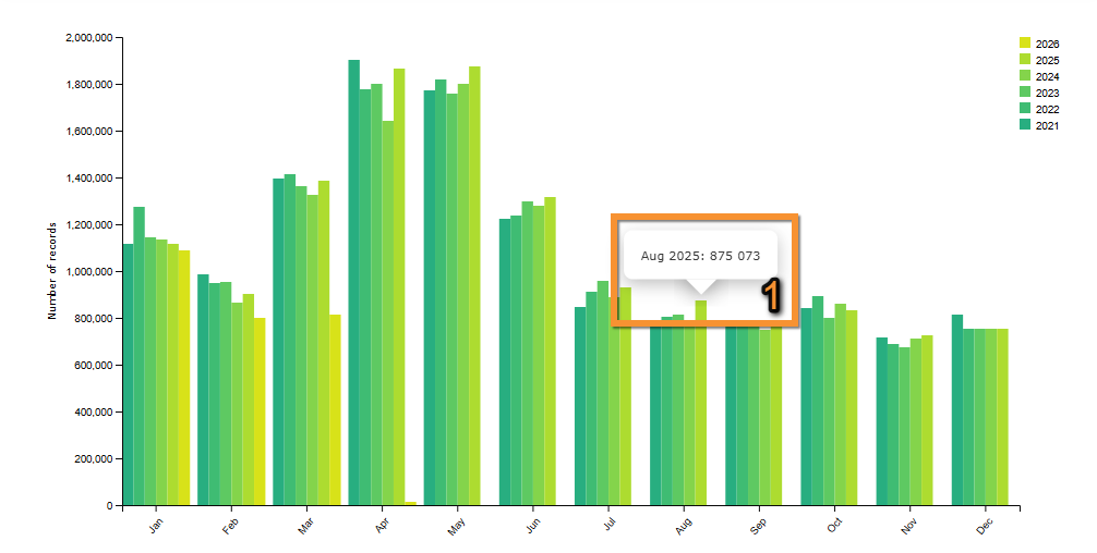
Number of records
See number of records submitted to biolovision systems during the timeframe selected.
Select which taxonomic groups to visualise by checking/unchecking them below the graph.
Move the pointer on web graphic to see details on species in each column.
Move the pointer on the image to see the description of this example.
|
Number of records.
1. Apply filters. Filters Results Details |
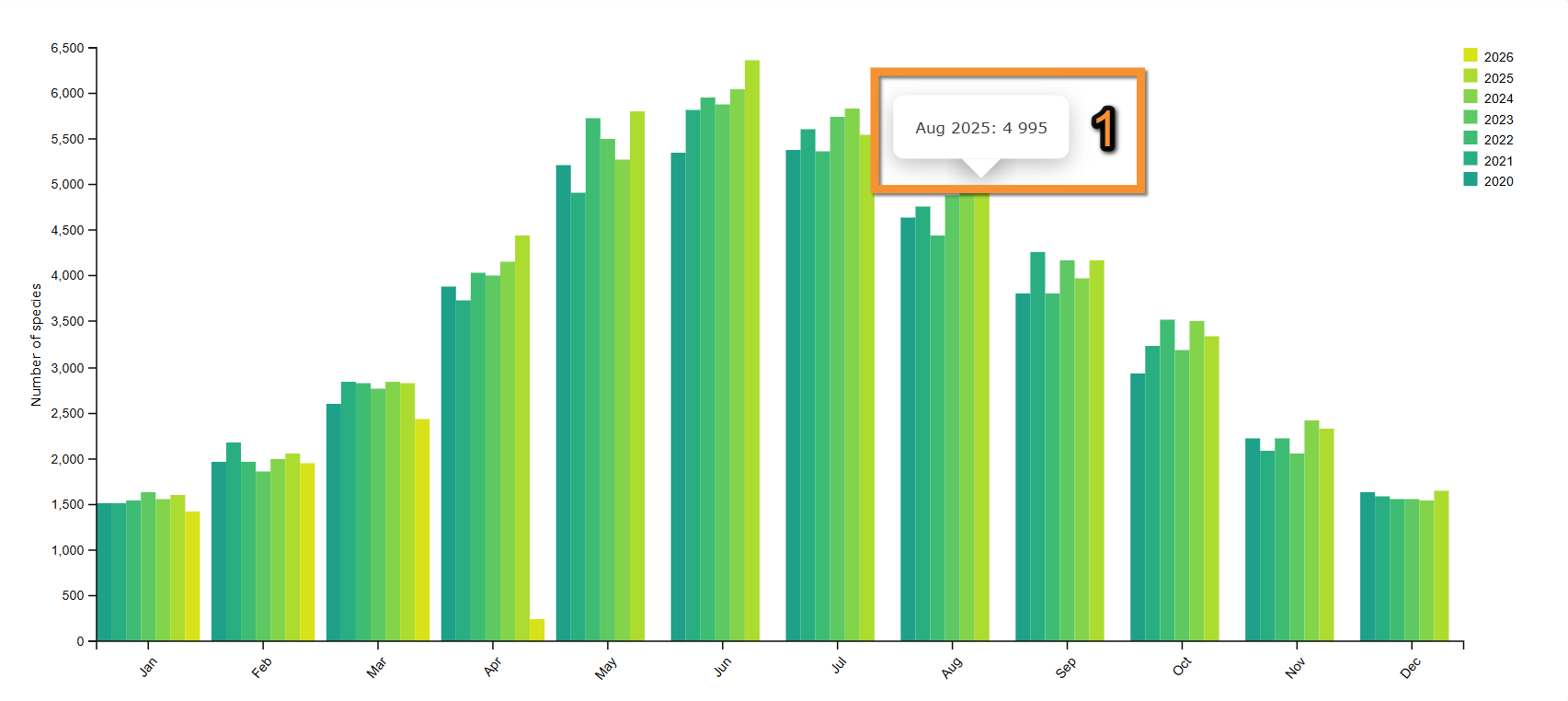
If selecting a monthly graph, see number of records submitted each month for the last few years.
Move the pointer on web graphic to see details on species in each column.
Move the pointer on the image to see the description of this example.
|
Number of records per month.
1. Move pointer on a column to see data details. August 2025 |
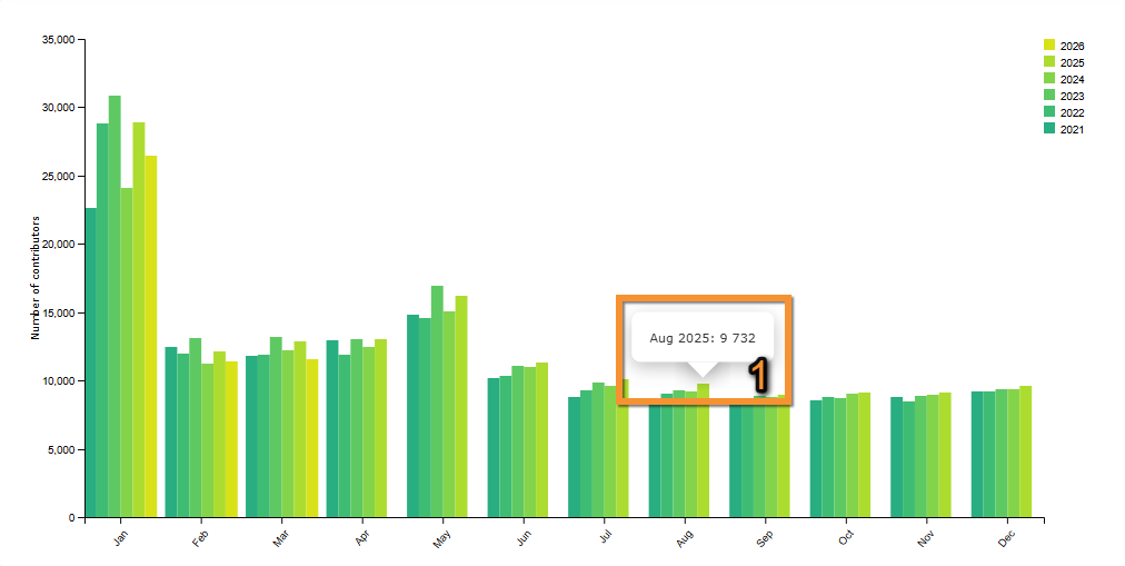
Number of contributors
See number of observers that submitted data to biolovision systems during the timeframe selected.
Move the pointer on the image to see the description of this example.
|
Number of contributors. January 2025 February 2025 March 2025 April 2025 May 2025 June 2025 July 2025 August 2025 September 2025 October 2025 November 2025 December 2025 January 2026 February 2026 March 2026 |

If selecting a monthly graph, see number of contributors each month for the last few years.
Move the pointer on web graphic to see details on species in each column.
Move the pointer on the image to see the description of this example.
|
Number of contributors per month.
1. Move pointer on a column to see data details. August 2025 |
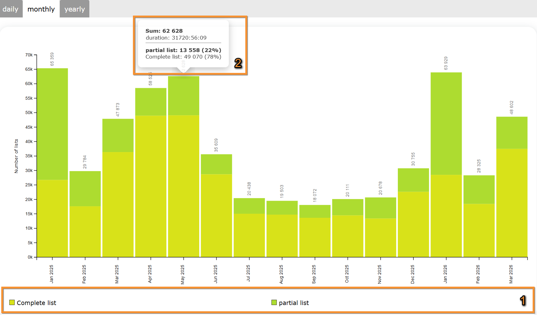
Number of lists
See number of complete and partial lists submitted to biolovision systems.
Move the pointer on the image to see the description of this example.
Move the pointer on web graphic to see details on species in each column.
|
Number of lists.
1. Legend: See color correspondence for complete and partial lists. January 2025 February 2025 March 2025 April 2025 May 2025 June 2025 July 2025 August 2025 September 2025 October 2025 November 2025 December 2025 January 2026 February 2026 March 2026 Details May 2025 |
If selecting a monthly graph, see number of lists per month during the last few years.
Move the pointer on web graphic to see details on species in each column.
Move the pointer on the image to see the description of this example.
|
Number of lists per month.
1. Move pointer on a column to see data details. August 2025 |

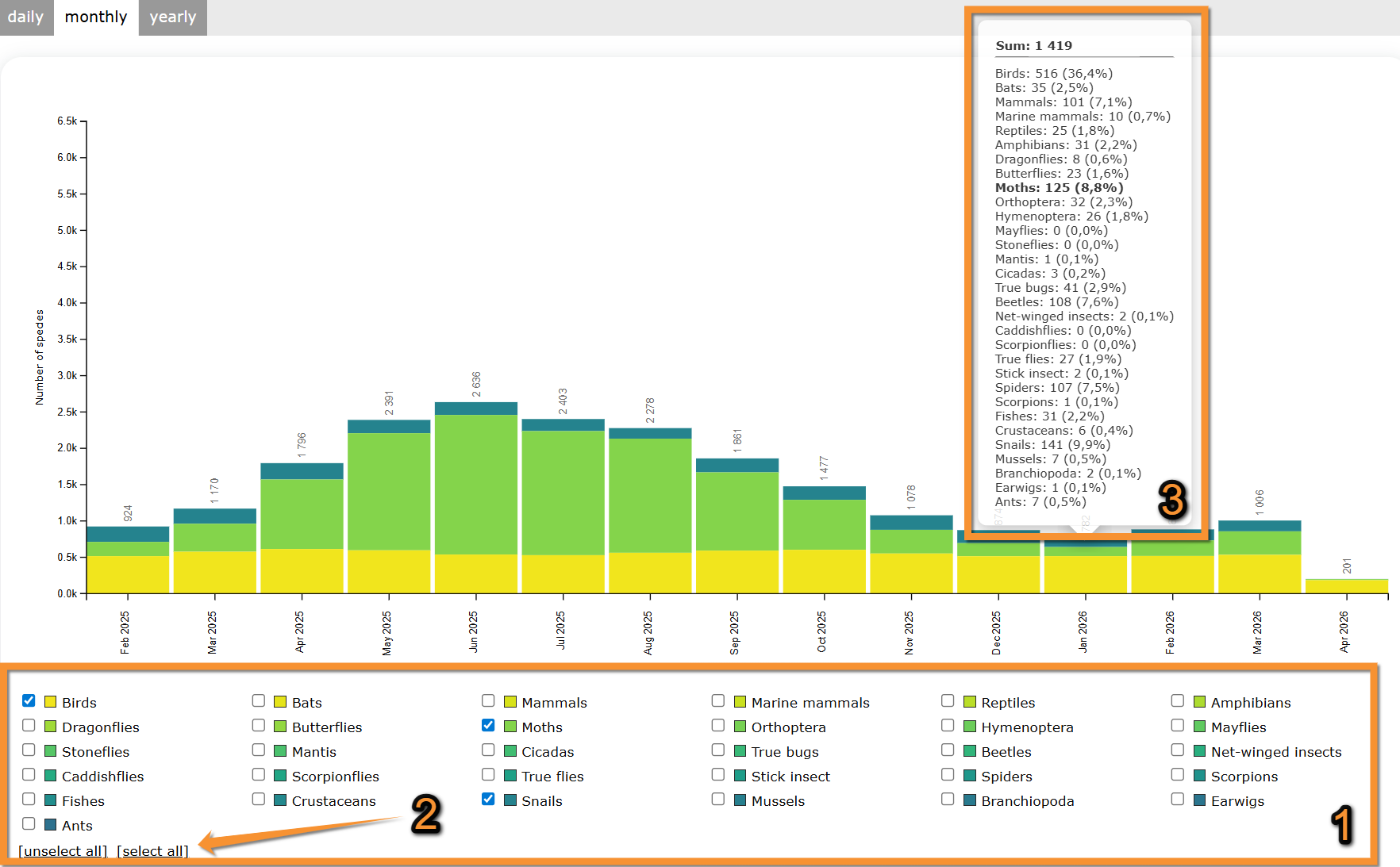
Number of species
See number of species submitted to the biolovision systems,
Select which taxonomic groups to visualise by checking/unchecking them below the graph.
Move the pointer on web graphic to see details on species in each column.
Move the pointer on the image to see the description of this example.
|
Number of species.
1. Apply filters. February 2025 March 2025 April 2025 May 2025 June 2025 July 2025 August 2025 September 2025 October 2025 November 2025 December 2025 January 2026 February 2026 March 2026 April 2026 Legend January 2026 |
If selecting a monthly graph, see number of species submitted each month during the last few years.
Move the pointer on web graphic to see details on species in each column.
Move the pointer on the image to see the description of this example.
|
Number of species per month.
1. Move pointer on a column to see data details. August 2025 |
[Top to Temporal distribution]
[Top to Contribution statistics]
[Back to Statistics]
Distribution by county
Distribution by county. Menu.
See data organized by area.
1. Choose taxonomic group to visualise.
Move pointer over icons to see meaning.
2. Choose from the expandable menu type of distribution to display.
Note available areas are dependent on local portal and may differ from country to country.
3. Choose timeframe to visualise from the tabs on top:
· Daily, to see the last 30 days;
· Monthly, to see the last 15 months;
· Yearly, to see all years since 2000.
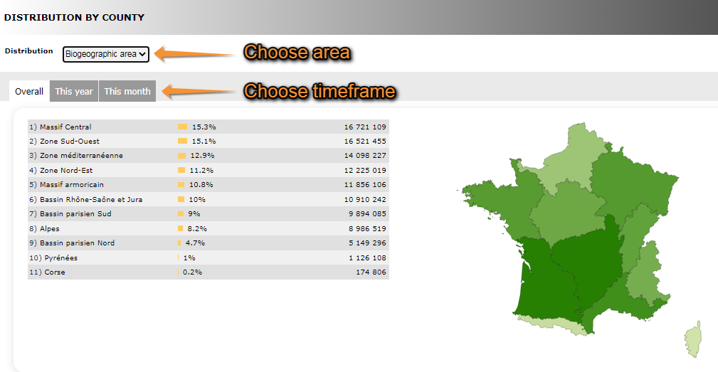
Distribution by county. Selecting data.
1. Choose taxonomic group
2. Choose area
3. Choose timeframe
4. See results.
· Note darker colour represents a higher number of observations.
· Place pointer on web map to see data for the selected area.
· Selected are is highlighted in yellow.
Move the pointer on the image to see the description of this example.
|
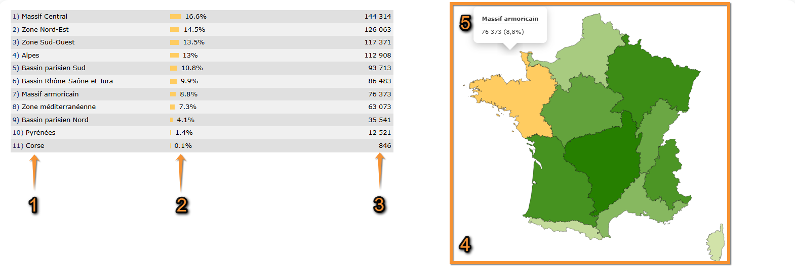
Distribution by county. Results.
1. List of areas selected Massif Central Corse |
NOTE the results obtained at the Distribution by county section, at the Geographical distribution section and at the Info by species > Map may look the same. However,
Distribution by county represents number of records per region,
Geographical distribution represents number of species per region, and
Info by species > Map represents number of records of a previously selected species, per region.
[Top to Distribution by county]
[Top to Contribution statistics]
[Back to Statisticds]
Info about lists

Info about lists. Menu.
See:
· Number of complete lists per month/year,
· Distribution of complete lists by cantons, and/or
· The most active observers for lists.
Number of complete lists per month/year
See the number of complete lists per month since the beginning of Biolovision.
Notice darker colour indicates a higher number of complete lists submitted.
Place pointer on a cell in the web graph to see number of complete lists for that month and year.
Move the pointer on the image to see the description of this example.
|
Number of complete lists.
1. Legend: the darker the colour, the higher the number of complete lists submitted. July 2015
|

Distribution of complete lists by cantons
See amount of complete lists submitted per area.
Select timeframe:
· This year, or
· overall.
Note the darker the colour, the more records were submitted for this area.
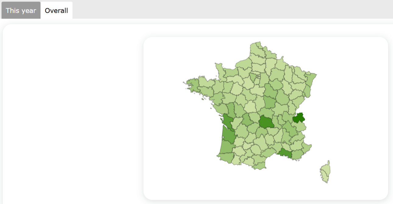
Distribution of complete lists by county.
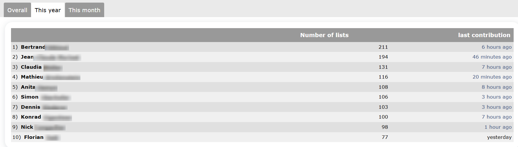
The most active observers for lists
See number of lists submitted for the most active observers during the selected period of time; and the time of the last contribution.
Select timeframe:
· Overall,
· this year, or
· this month.
Move the pointer on the image to see the description of this example.
|
The most active observers for lists. Observer 1 Observer 2 Observer 3 Observer 4 Observer 5 Observer 6 Observer 7 Observer 8 Observer 9 Observer 10 |
[Top to Info about lists]
[Top to Contribution statistics]
[Back to Statistics]
Stats by municipality
Stats by municipality. Menu.
See data submitted grouped by municipality.
1. Choose taxonomic group on top,
2. choose year to visualise, and
3. choose geographical region.
Place the pointer on a region or a taxonomic group to see its correspondence.
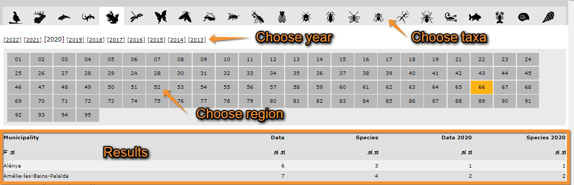
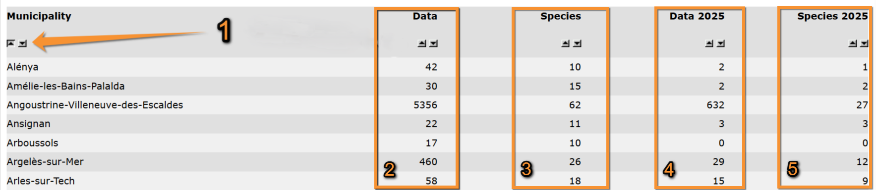
Stats by municipality.
1. Choose taxonomic group
2. Choose year
3. Choose geographical area
See a list of municipalities within the geographical area selected with number of records for the selected year and taxonomic group.
Use ![]() to alternate between ascending and descending order.
to alternate between ascending and descending order.
Move the pointer on the image to see the description of this example.
|
Municipality stats. Results.
1. Change order Alénya Amélie-les-Bains-Palalda Angoustrine-Villeneuve-des-Escaldes Asignan Arboussols Argèlers-sur-Mer Arles-sur-Tech |
[Top to Stats by municipality]
[Top to Contribution statistics]
[Back to Statistics]
Observer stats
See statistics about observers.
Choose between
· General info,
· Info about lists, or
· Distribution by country.

General info

General info. Menu.
See
· your contribution in relation to others' to the local portal,
· the ten most active observers to the local portal and your position.
1. Choose taxonomic group to visualise.
2. Choose timeframe to visualise.
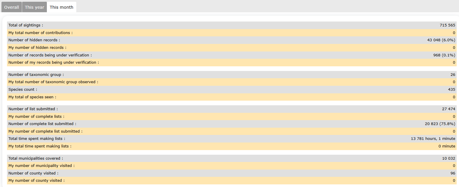
Your statistics of use of local portal
See
· your contributions in yellow and,
· others' contributions in grey.
Note sections available depend on the taxonomic group selected. Not all taxonomic groups will show the same statistics.
See this image as an example.
Move the pointer on the image to see a description of this example.
|
Your contributions. Total of sightings Species count Total municipalities covered Number of counties visited |
The most active observers
See
· the ten most active observers for the timeframe selected, and
· if you contributed during this period, see your position in relation to other observers.
Move the pointer on the image to see a description of this example.
|
The most active observers.
1. Your position in relation to other observers. Observer 1 Observer 2 Observer 3 Observer 4 Observer 5 Observer 6 Observer 7 Observer 8 Observer 9 Observer 10 Your position |

[Top to General info]
[Top to Observer stats]
[Back to Statistics]
Info about lists
Info about lists. menu.
See
· Number of complete lists per month/year,
· Distribution of complete lists by county, and/or
· The most active observers for lists.
Number of complete lists per month/year
See the number of complete lists per month since the beginning of the local portal.
Notice darker colour indicates a higher number of complete lists submitted.
Place pointer on a cell in the web graph to see number of complete lists for that month and year.
Move the pointer on the image to see the description of this example.
|
Number of complete lists.
1. Legend: the darker the colour, the higher the number of complete lists submitted. July 2015 |
Distribution of complete lists by county
See amount of complete lists submitted per area.
Select timeframe:
· This year, or
· overall.
Note the darker the colour, the more records were submitted for this area.

Distribution of complete lists by cantons.
The most active observers for lists
See
· the ten most active observers for the timeframe selected, and
· if you contributed during this period, see your position in relation to other observers.
Select timeframe:
· Overall,
· this year, or
· this month.
Move the pointer on the image to see a description of this example.
|
The most active observers for lists. Observer 1 Observer 2 Observer 3 Observer 4 Observer 5 Observer 6 Observer 7 Observer 8 Observer 9 Observer 10 |
[Top to Info about lists]
[Top to Observer stats]
[Back to Statistics]
Distribution by county
Distribution by country. Menu.
See
· The number of observers in different participating countries, and/or
· the distribution of observers by biogeographic area, region or county.
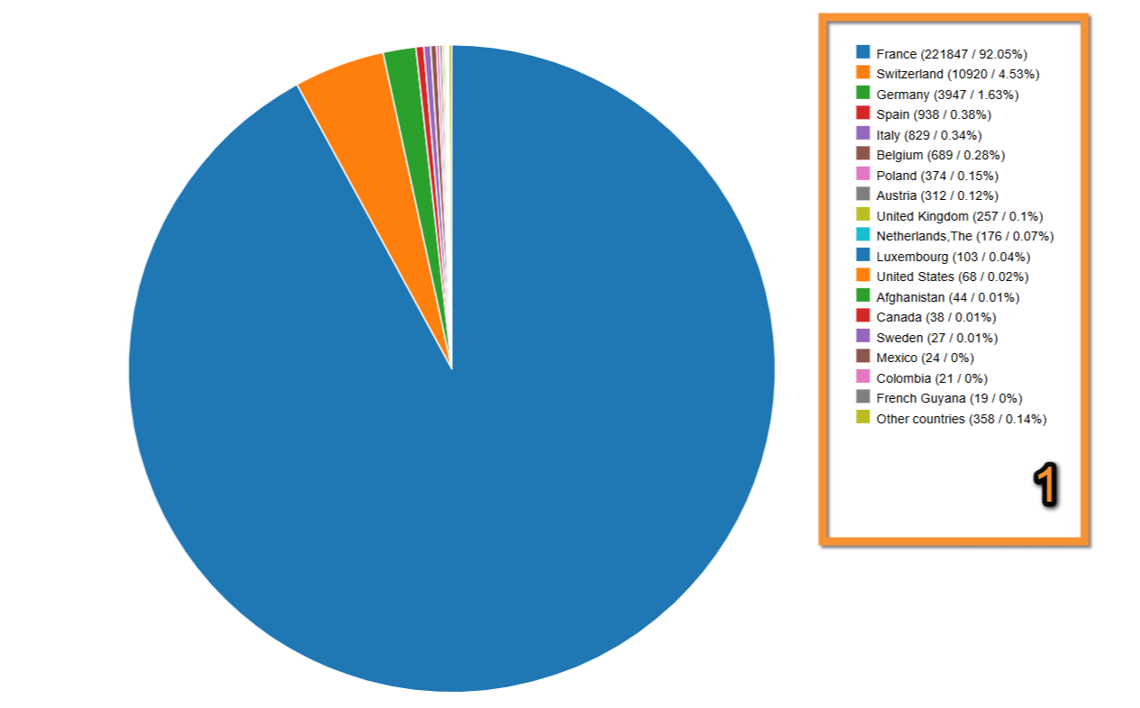
Breakdown by country
See relative number of total contributions for each country.
Move the pointer on labels to see the description of this example.
|
Breakdown by country. 1. Legend: colour correspondence, total number of contributions for each country and its relative importance. France |
Distribution
1. Choose from the expandable menu type of distribution to display.
Note available areas are dependent on local portal and may differ from country to country.
2. Choose timeframe to visualise from the tabs on top.

Distribution.
1. Choose area
2. Choose timeframe
3. See results.
· Note darker colour represents a higher number of observations.
· Place pointer on web map to see data for the selected area.
· Selected are is highlighted in yellow.
Move the pointer on the image to see the description of this example.
|
Distribution by county. Results.
1. List of areas selected Massif Central Corse |
NOTE the results obtained at the Distribution by county section, at the Geographical distribution section and at the Info by species > Map may look the same. However,
Distribution by county represents number of records per region,
Geographical distribution represents number of species per region, and
[[Statistics#4._Map|Info by species > Map represents number of records of a previously selected species, per region.
[Top to Distribution by county]
[Top to Observer stats]
[Back to Statistics]
Species stats
Statistics referring to species, for example, numbers and distribution.

Global info

Global info. Menu.
List of the 50 most observed species per taxa.
1. Choose the taxonomic group from the horizontal bar on top. Place mouse pointer on silhouettes to see which group they represent. Use arrows if necessary to see all options.
2. Choose time frame from tabs:
· All data: all data hold in the system,
· this year: only data from the current year, or
· this month: only data from the current month.

Global info. Selecting data..
1. Taxonomic group
2. Timeframe
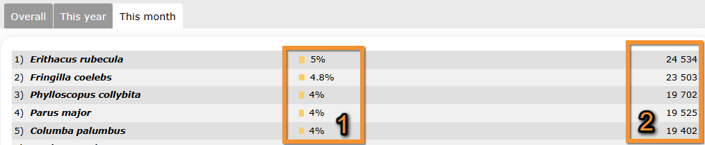
See a list of the 50 most recorded species and their abundancies.
Move the pointer on the image to see the description of this example.
|
Most abundant species. Erithacus rubecula Fringilla coelebs Phylloscopus collybita Parus major Columba palumbus
1. Relative numbers |
[Top to Global info]
[Top to Species stats]
[Back to Statistics]
Info by species
Info by species. Menu.
See information relative to the selected species.
1. Select from the expandable menu the geographical area to see the data about.
2. Choose the taxonomic group you are interested in. Use arrows if necessary to see all options. Place mouse pointer on silhouettes to see which taxonomic group they represent.
3. Type a species. Type the species name, or part of it, on the left and choose from the expandable menu on the right.
4. Click Display when done.
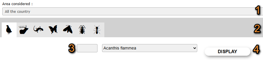
Selecting geographical area and taxonomic group.
1. Area considered: Select the geographical.
2. Taxonomic group: Select the taxonomic group.
3. Species: Select the species.
4. Display: See statistics.
5. Use tabs to select which type of information to see for the selected species.
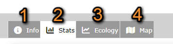
Species available information.
1. General information
2. Observations
3. Group size and altitude
4. Distribution
1. Info
See general information about the species, like names in different languages, conservation status or picture.
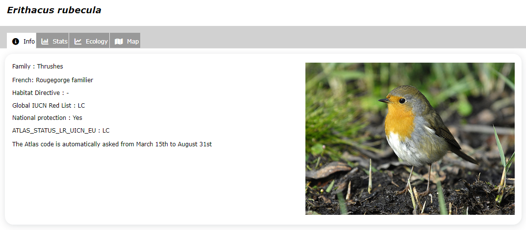
Info by species. Info tab. Example.
2. Stats
See
· Summary of records
· Relative weekly frequency of the species
· Annual relative frequency of the species
· Records grouped by week
Summary
1. Choose time frame from the tabs:
· All data: all data hold in the system,
· this year: only data from the current year, or
· this month: only data from the current month.
See a summary of statistics for the selected timeframe and species.
Note number of records in a complete list gives you the records in a complete list relative to the total number of records.
Move the pointer on the image to see the description of this example.
Info by species. Stats.
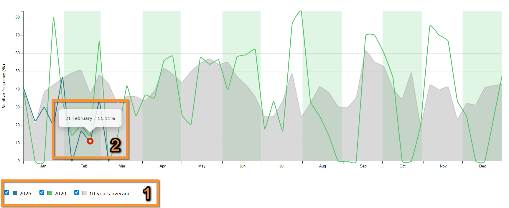
Relative weekly frequency of the species
See percentage of complete lists containing the species, by week, with comparison with the previous years.
· Click on Show more for further details.
· Check/uncheck cells to select which set of years to compare.
· Place pointer on current year line to see detailed data for a specific date.
Move the pointer on the image to see the description of this example.
|
Relative weekly frequency of the species
1. Check/Uncheck to select times to show. Legend Date September data |
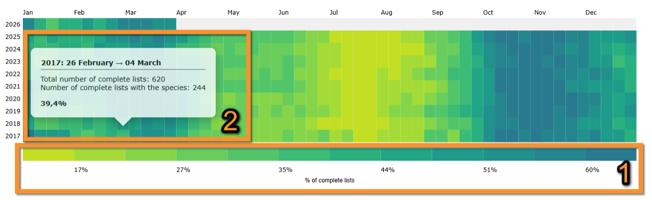
Annual relative frequency of the species
See percentage of complete lists containing the species, by week, since the year following the launch of the online database
· Click on Show more for more information.
· Darker colour indicates a higher presence of the selected species recorded.
· Place pointer on a cell in the web graph to see number of complete lists containing the selected species for that month and year.
Move the pointer on the image to see the description of this example.
|
Annual relative frequency of the species.
1. Legend: the darker the colour, the higher the number of complete lists submitted. 2017: 26th february -> 4th March
|
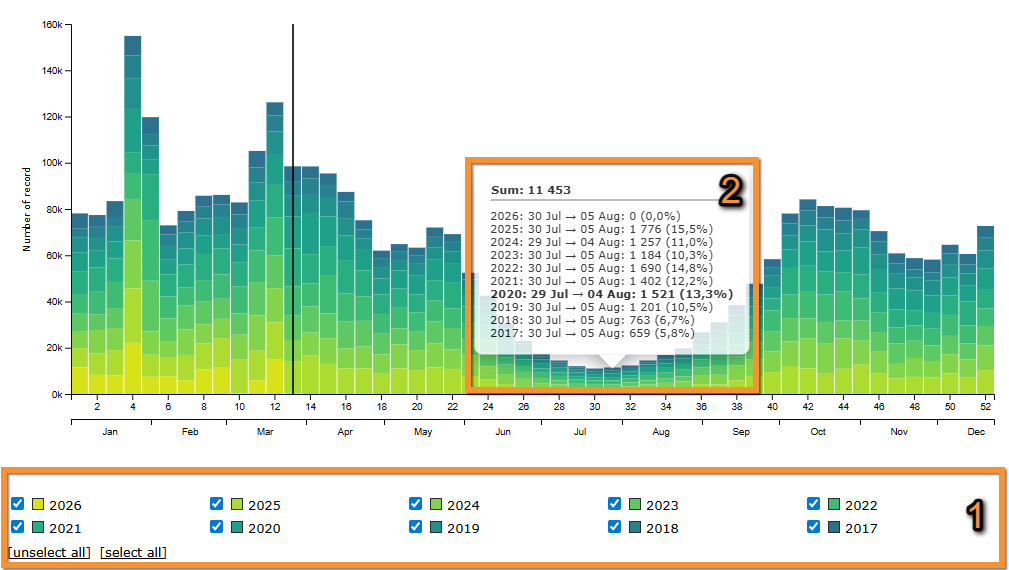
Records grouped by week
See number of data grouped per week.
· Click on Show more for more information.
· Check/uncheck cells to select which set of years to compare.
· Use Select all/unselect all option to check/uncheck all cells at once.
· A vertical line marks the current date.
· Place pointer on any column section on the web graph to see the number of records for the selected species for the similar week all years selected. Note the week marked by the pointer is highlighted in bold.
Move the pointer on the image to see the description of this example.
|
Records grouped by week. Filters Details |
[Top to Stats]
[Top to Info by species]
3. Ecology
See
· Group size distribution
· Altitude distribution
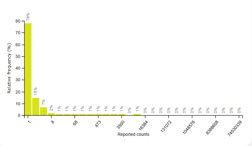
Group size distribution
See frequency in which each group size is reported.
· Click on Show more for more information.
Move the pointer on the image to see the description of this example.
|
Group size distribution. Group size |
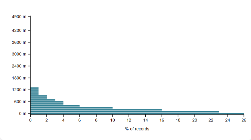
Altitude distribution
See percentage of observations a different altitudes.
· Click on Show more for more information.
Move the pointer on the image to see the description of this example.
|
Altitude distribution. Altitude distribution |
[Top to Ecology]
[Top to Info by species]
4. Map
See the geographical distribution of the selected species.
1. Select from the expandable menu type of distribution to display.
Note available areas are dependent on local portal and may differ from country to country.
Visit Web interface > Local portal > Various > Glossary for definitions of all possible areas.
2. Select time frame from tabs:
· All data: all data hold in the system,
· this year: only data from the current year, or
· this month: only data from the current month.
Distribution.
1. Choose area
2. Choose timeframe
3. See results.
· Note darker colour represents a higher number of observations.
· Place pointer on web map to see data for the selected area.
· Selected are is highlighted in yellow.
Move the pointer on the image to see the description of this example.
|
Distribution by county. Results.
1. List of areas selected Massif Central Corse |
NOTE the results obtained at the Distribution by county section, at the Geographical distribution section and at the Info by species > Map may look the same. However,
Distribution by county represents number of records per region,
Geographical distribution represents number of species per region, and
Info by species > Map represents number of records of a previously selected species, per region.
[Top to Map]
[Top to Info by species]
[Top to Species stats]
[Back to Statistics]
Geographical distribution
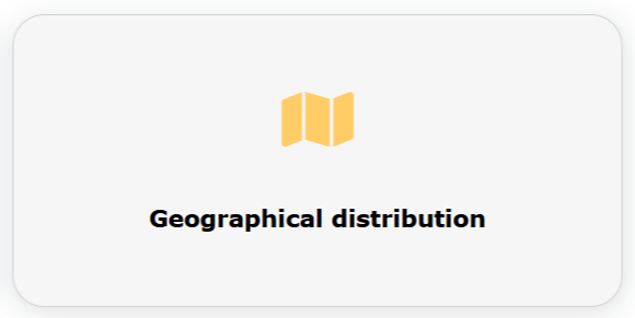
Geographical distribution. Menu.
Number of species per geographical area.
1. Select from the expandable menu type of distribution to display.
Note available areas are dependent on local portal and may differ from country to country.
Visit Web interface > Local portal > Various > Glossary for definitions of all possible areas.
2. Select time frame from tabs:
· All data: all data hold in the system,
· this year: only data from the current year, or
· this month: only data from the current month.
Distribution.
1. Choose area
2. Choose timeframe
3. See results.
· Note darker colour represents a higher number of observations.
· Place pointer on web map to see data for the selected area.
· Selected are is highlighted in yellow.
Move the pointer on the image to see the description of this example.
|
Distribution by county. Results.
1. List of areas selected Massif Central Corse |
NOTE the results obtained at the Distribution by county section, at the Geographical distribution section and at the Info by species > Map may look the same. However,
Distribution by county represents number of records per region,
Geographical distribution represents number of species per region, and
Info by species > Map represents number of records of a previously selected species, per region.
[Top to Geographical distribution]
[Top to Species stats]
[Back to Statistics]
Confinement statistics
See observations done from home during the confinement of 2020.
Data goes from 14th March to 15th May and compiles all ornitho portals.
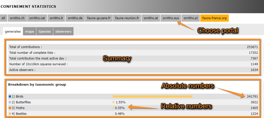
Choose the portal from the tabs on top (see image Confinement stats: Generales, summary).
Generales
Tap on Generales tab to see general statistics for the chosen portal.
See
· number of contributions, area covered and number of observers, at the top; and
· number of contributions per taxonomic group, both in relative and absolute values, at the bottom.
Confinement stats: Generales, summary.
Underneath, observations are represented on a graph.
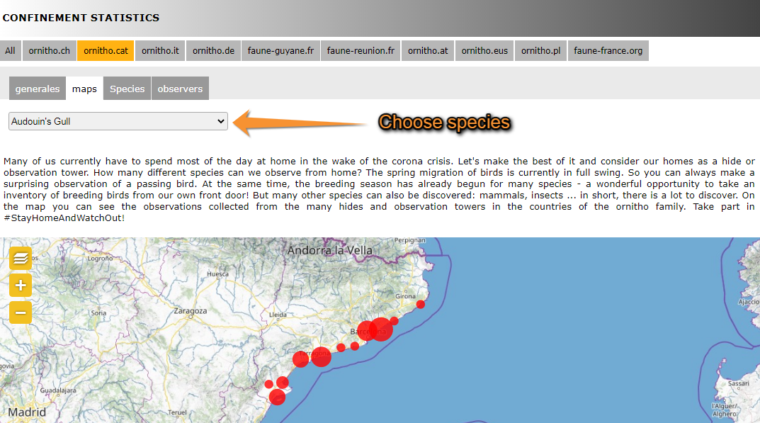
Map
It shows a map with the observations for the selected species. Choose the species to visualise from the expandable menu on top (see image Confinement stats: Map). Size of point on map represents the number of observations. To navigate the map, see wiki section Web interface > Navigating the map.
Confinement stats: Map.
Species
Returns a list of all species recorded and its numbers in descending order (see image Confinement stats: Species). Choose the taxonomic group you want to visualise from the expandable menu. The returning list indicates the number of records for each species, and the number of lists including the species both in aboslute and relative numbers. In the given example (see image Confinement stats: Species), House Sparrows were recorded a total of 4698 times in tht ornitho.cat portal, 3845 of these records were part of one of the 4629 total lists recorded. Therefore, House Sparrows were recorded in 83 % of lists submitted. Go to wiki section Web interface > Codes and symbols to see correspondence of colour codes to rarity level (image Symbols for rarity level in Fauna-France). See your own observations by clicking on the button above the list (see image Confinement stats: Species).
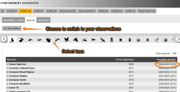
Confinement stats: Species.
Observers
A graph on top represents the number of active observers during each day of confinement. Underneath, observers are listed along with their corresponding number of records, lists and hours of observation. Those contributing higher number of lists are on top. On the example below (see image Confinement stats: Observers), the observer contributing the most lists, their name hidden, recorded a total of 3975 observations of 65 different species belonging to 348 lists during over 6h of observation.
.png)
Confinement stats: Observers.
[Top to Confinement statistics]
[Back to Statistics]
Note: images and examples are drawn from the French portal Faune-France. The design and position of some tools may vary slightly from portal to portal. To see a list of portals go to wiki section Local portals and partners. |